

Published March 6, 2026
First Friday Update March 6, 2026


Well, 2026 has already been a lot of things — but boring isn’t one of them.
Today in El Paso County we have 1,800 existing single-family homes available for sale. That’s up from 1,425 this time last year, for an overall increase of over 26%. Sales volume year-over-year for the first two months of 2026 has increased by only 1.3%, so you can clearly see supply outpacing demand.
For the month of February we saw 773 total sales in our MLS, with a median sold price of $465,000. That’s 43 units more than February of last year, and the median price is just $8,500 lower, which statistically around here is pretty much irrelevant.
What is important to understand is that a small increase in sales volume combined with a much larger increase in inventory signals the market shifting toward oversupply.
Now, the counter-argument is that if 773 units sold, we still only have roughly three months of supply, which traditionally signals a seller’s market. However, the difference between seller expectations and what the offers actually look like suggests something closer to the opposite.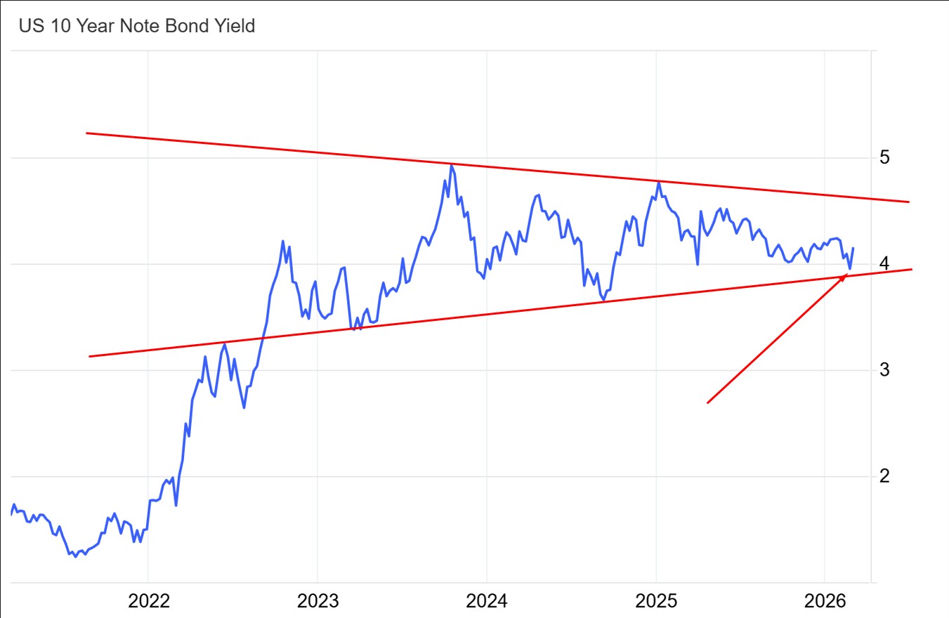
A little over a week ago we were celebrating the lowest mortgage rates in four years. Pre-quals were coming in steady in the 5% range, and it seemed like buyer activity was picking up pretty solidly. Lenders were saying things like rates had “gone through the floor” and “cratered.”
My take was simple: throw 3.6% on the U.S. 10-year yield and then we’ll call it a real move. Otherwise we’re just range-bound.
Then the newest war popped off.
Oil spiked well over 20% this week, and interest rates on U.S. debt rebounded right back into the wedge you can see above. What’s remarkable about the move is actually how unremarkable it is, considering the general global situation today.
I went to a meeting this week with some very smart people. One of them — representing a large local credit union — mentioned that oil prices and interest rates tend to move together.
I hadn’t heard that correlation before, so I checked the logic.
Turns out he’s right — sometimes. And right now is kind of one of those times.
Statistics has a fun concept called the correlation coefficient, which measures the strength of relationships between different things. For example, oil prices and U.S. Treasury yields often move together with a correlation coefficient as high as 0.6. Since 1 is perfect, a 0.6 correlation is fairly strong, and that’s roughly where we are today.
However, this relationship tends to break down during periods of peace and stability.
It doesn’t take a genius to turn on the news right now and realize peace and stability aren’t exactly on the menu.
Let’s talk about one of the strongest correlations in economics.
That is the relationship between the average price of a house in the U.S. and M2 money supply.
If you’re new to my rants and don’t know what M2 money is, here’s the quick version. M2 is the money you can get your hands on fast — cash, checking accounts, savings accounts, and short-term deposits.
Check out this fun chart from the Fed showing M2 money supply since roughly 1960..png)
Some things to digest here. The gray lines are recessions. The fat ones are the bad ones. There’s a little tiny blip in 2020 — we were here for that one and remember it well.
To-go margaritas, debt forbearance, and the constant fear of death coming from the TV.
Good times.
Here’s why this matters.
The correlation coefficient between M2 money supply and the average cost of a house is roughly 0.9. That’s about as strong as a correlation gets without being literally perfect..png)
.png)
Let’s overlay the average and median prices of single-family homes in America.
See how these graphs almost mirror each other?
That’s what a 0.9 correlation looks like.
So going forward I’m going to make an argument about why the housing market isn’t going to crash in dollar terms, and I invite you to argue with me.
Let’s talk about war for a minute.
Not morality. Not right or wrong.
Just the macro-economic effect.
Let’s start with Vietnam, because it was toward the end of that war that our modern monetary system really formed with the loss of the gold standard.
Before the war, M2 money supply grew around 5% annually. During the war it grew between 8–12% depending on the year.
It’s hard not to notice the steepening line around 1971 on all three graphs. That’s when the U.S. left the gold standard and moved fully to a fiat currency system.
Notice the acceleration of M2 growth during the Global War on Terror.
Notice the further acceleration after the 2008 financial crisis.
Notice the steady growth through the relatively stable years of 2014–2020.
Then 2020 happened.
Our response to it was essentially the same economic response we used for World War II.
Between 2020 and 2022, M2 money supply expanded at an average annual rate of 25%.
That is absolutely insane.
And the housing market responded exactly the way you’d expect.
Remember those days?
Infinite appraisal gaps. Escalation clauses.
At SRG we even had a patented taco clause where we offered the seller $500 toward tacos in a city of their choice.
That dumb clause sealed two real estate deals because tacos were actually written into the real estate contract.
As Drake would say:
No lie. No lie. No liiiiiie.
Funny memories aside, we have some serious macro factors suggesting more money printing is likely ahead.
The war in Ukraine is now in its fifth year and is the most destructive conflict in Europe since WWII. Current rebuilding estimates are somewhere around $1 trillion or more.
Once that war ends — hopefully sooner rather than later — there will almost certainly be massive monetary expansion to rebuild the country.
Just like with the Marshall Plan after WWII, that money printing will not directly cause inflation in the U.S. because the dollars are being exported overseas.
However, it will indirectly contribute to inflation.
Reconstruction requires massive amounts of commodities — steel, copper, lumber, energy — all of which are purchased on the same global market that our builders use.
If those materials are being consumed in huge quantities overseas, our local builders will be buying from the same supply pool at higher prices.
War historically leads to commodity booms, and oil right now is just one early indicator.
So my argument is simple:
I don’t think the housing market will crash in dollar terms.
In fact, in some ways it already has — depending on what you measure it against.
Take a look at housing prices measured in gold.
| Year | Avg U.S. home sale price | Gold price at Jan. 1 / first trading day | House price in oz of gold |
|---|---|---|---|
| 1970 | $27,000 | $35.12 | 768.8 oz |
| 1975 | $40,900 | $185.00 | 221.1 oz |
| 1980 | $73,600 | $559.00 | 131.7 oz |
| 1985 | $98,500 | $306.25 | 321.6 oz |
| 1990 | $149,500 | $401.65 | 372.2 oz |
| 1995 | $153,500 | $381.40 | 402.5 oz |
| 2000 | $202,900 | $289.00 | 702.1 oz |
| 2005 | $288,500 | $428.95 | 672.6 oz |
| 2010 | $275,300 | $1,097.25 | 250.9 oz |
| 2015 | $348,000 | $1,184.88 | 293.7 oz |
| 2020 | $383,000 | $1,524.50 | 251.2 oz |
| 2025 | $514,200 | $2,624.81 | 195.9 oz |
Let’s assume the average U.S. home price right now is about $515,000.
Gold is currently around $5,185 per ounce.
That means it costs less than 100 ounces of gold to buy a house in the United States right now.
As you can see, in relative terms, that’s the cheapest housing has been since the U.S. left the gold standard.
Measured against gold, the housing market has already crashed to historic lows.
But everything is relative.
There’s also a fun economic measure called the Big Mac Index, which uses the price of a Big Mac as a proxy for inflation because it includes ingredients, labor, real estate, taxes, and utilities.
And in Big Mac terms, housing is at record highs, similar to the peaks before the 2008 housing crisis.
| Year | Avg US Home Price | Avg Big Mac Price | House Price in Big Macs |
|---|---|---|---|
| 1970 | $27,000 | $0.65 | 41,538 Big Macs |
| 1975 | $40,900 | $0.85 | 48,118 Big Macs |
| 1980 | $73,600 | $1.20 | 61,333 Big Macs |
| 1985 | $98,500 | $1.60 | 61,563 Big Macs |
| 1990 | $149,500 | $2.45 | 61,020 Big Macs |
| 1995 | $153,500 | $2.99 | 51,338 Big Macs |
| 2000 | $202,900 | $3.58 | 56,676 Big Macs |
| 2005 | $288,500 | $3.73 | 77,346 Big Macs |
| 2010 | $275,300 | $3.73 | 73,807 Big Macs |
| 2015 | $348,000 | $4.79 | 72,651 Big Macs |
| 2020 | $383,000 | $5.67 | 67,548 Big Macs |
| 2025 | $514,200 | $6.60 | 77,909 Big Macs |
The big takeaway here is that housing isn’t always the perfect inflation hedge, but it’s certainly a better hedge than investing in sandwiches.
Going forward I’m not suggesting that housing is going to rip and run like it did in 2020.
I do not expect mortgage rates to drop significantly, and I do expect inventory to continue rising.
As of today the county trustee hasn’t published February data yet, but the trend shows a steady acceleration in foreclosure activity.
We’re also seeing an increase in underwater listings, largely because there was effectively a five-year moratorium on dealing with them.
That backlog is now being worked through and will likely impact inventory in the short term.
The long-term impact will depend largely on how loose monetary policy becomes.
Right now we’re sitting at roughly a 4% overall mortgage delinquency rate, with about 1.3% being 90+ days late.
For comparison, that’s about where we were in 2015, and less than half of what it took to trigger the 2009 housing crisis.
I do expect foreclosure activity to increase somewhat over the next couple of years.
That said, I very much doubt we see a deep correction in dollar terms, because the money printer is already warming up, and we’re not even formally in a crisis yet.
The real crisis this trajectory ultimately points toward isn’t a housing crash.
It’s a loss of confidence in the dollar itself. And that is something for which we have plenty of past examples to learn from.
What do you think will happen next? Tell me about it I want to know your vision of the future.


